Top 2026 Streetwear Trends: Colors, Fabrics, and Silhouettes Defining the Year
- Share
- publisher
- Chanjoye Editorial Team
- Issue Time
- Sep 11,2026
Summary
A practical 2026 streetwear trend report for apparel brands: color direction, fabric choices, silhouettes, decoration, and the production decisions that turn a trend into a sellable collection.
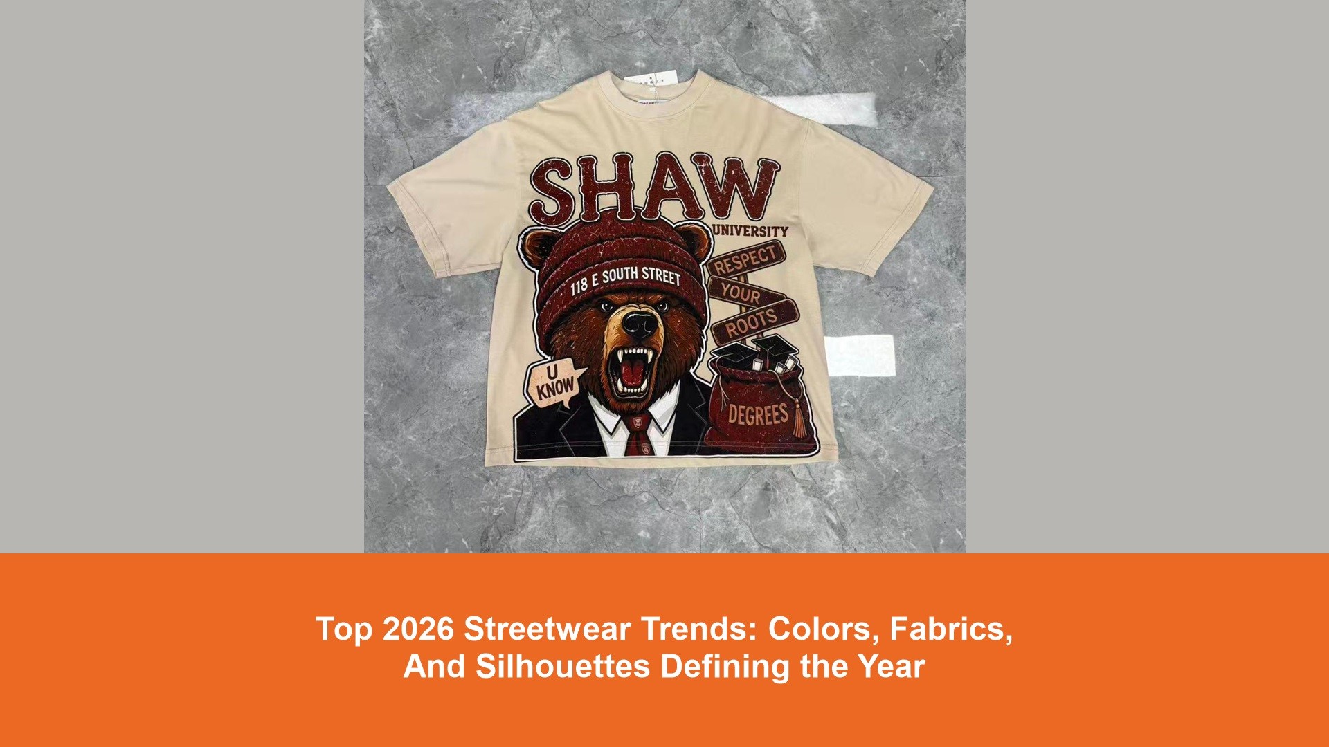
Short answer: the most useful streetwear direction for 2026 is not a single "must-have" color or garment. It is a product system built around expressive but wearable color, tactile fabrics, proportion-led silhouettes, and details that still make sense at production scale. Brands that translate those ideas into a concise assortment, clear specifications, and physical samples are more likely to create a collection that feels current without becoming disposable. For founders and buyers, trend work is most valuable when it reduces uncertainty. This guide turns broad fashion signals into practical choices for T-shirts, hoodies, bottoms, outerwear, trims, and manufacturing briefs. It is not a promise of sell-through: validate every direction against the brand's customer, price point, channel, and production calendar. Streetwear continues to reward a recognisable point of view, but customers also expect clothes to earn repeat wear. The strongest collections combine a distinctive visual cue with a familiar product role: a heavyweight tee with an unusual wash, a relaxed trouser with a useful pocket system, or a zip hoodie with a considered panel line. The garment needs to work before the graphic, campaign, or drop language asks it to carry the entire idea. That is why a 2026 range should be planned as a hierarchy. Keep a small core of dependable styles, use a few seasonal color or material stories, and reserve the most experimental treatments for controlled quantities. A brand can then test creative direction without tying all of its cash to one difficult fabric, wash, or silhouette. Color is moving between grounded utility tones and more visible accents. Charcoal, washed black, ink navy, olive, stone, tobacco, and off-white remain useful foundations because they support repeat wear and make trims, prints, and stitching easier to coordinate. Around them, a brand can introduce selective brights, softened pastels, acid notes, or saturated heritage colors as controlled accents rather than using every color in every style. Color forecasting is a starting input, not a purchase order. The Pantone Color Institute and directional services such as WGSN can help teams identify wider color conversations, but a clothing brand must still approve the actual lab dip, fabric lot, wash result, print standard, and trim color together. For garment dye, pigment dye, and heavy wash effects, expect variation. Treat variation as part of the intended character only when the tolerance is agreed in writing and represented by an approved sample. Otherwise, a mood-board color can become a costly dispute during bulk production. In 2026, fabric hand feel is part of the product story. Heavy jersey, brushed fleece, compact French terry, structured twill, nylon blends, textured knits, and denim with visible character can make a simple silhouette feel deliberate. Weight alone does not define quality, however. Recovery, pilling, shrinkage, skew, colorfastness, seam performance, and suitability for the chosen decoration all matter. Material claims also need evidence. The Textile Exchange Materials Market Report is a useful industry reference for responsible-material context, but a brand should only state fiber, recycled-content, or certification claims that its own supplier documents can support. A fabric label is not a sustainability strategy on its own. The silhouette shift is less about declaring every garment oversized and more about controlling proportion. Boxier tops can pair with straight or relaxed bottoms; cropped outerwear can balance fuller legs; wider trousers can still look intentional when rise, hem opening, and fabric drape are engineered together. The goal is a shape that looks designed in movement, not merely scaled up from a regular-fit block. Use real samples to settle fit. A tech pack should identify body length, chest or hip width, shoulder drop, sleeve length, rise, thigh, knee, hem opening, and grading approach. It should also say which measurement is critical to the intended silhouette. Reference photos are helpful, but they do not replace a measurement specification and a fitting review. Consider boxy tees, relaxed hoodies, cropped jackets, layered overshirts, and knit or jersey polos. Define how the shoulder, sleeve, and body length work together before adding decoration. Relaxed straight, wide-leg, curved-leg, and utility profiles can all work. Validate the leg volume with the actual fabric so a soft twill, rigid denim, and technical nylon do not produce the same pattern outcome by accident. Placement graphics, tonal embroidery, applique, high-density print, patches, and restrained distressing are most effective when they reinforce the fabric and cut. A dense embroidery on a light jersey may distort the chest. A large print on a heavily washed garment may crack or fade differently from the reference. A patch needs an edge finish that survives laundering. Each technique should be selected with its limitation in mind. For a small first order, consider a simpler hierarchy: one lead placement, one secondary identification point, and a label or trim package that makes the product recognisable. Screen printing may be efficient as quantities rise, while digital methods can be flexible for smaller runs. The right option depends on artwork, fabric, placement, expected durability, and minimums, not on a blanket claim that one method is always better. A focused range is easier to communicate, buy, and manufacture. Start with one or two anchor styles that show the brand's fit and fabric standards. Add complementary items that share color, hardware, or graphic language. Then isolate a limited test style for a new treatment such as a wash, panel construction, or more challenging trim. This gives the collection visual depth without forcing every SKU to carry development risk. For product-category context, compare the intended range against the styles shown in Chanjoye's product catalog. The useful exercise is not copying a catalog item; it is identifying where a design needs a different fabric, fit, decoration, or construction specification. Trend images and runway references often omit the information a factory needs. Before requesting a quote, turn the idea into a brief that separates appearance from construction. For each SKU, include flat sketches, reference photos, target fabric, composition, GSM or weight, color standards, measurement chart, stitch and seam notes, artwork files, print or embroidery details, label package, packaging, quantity by color and size, target delivery date, and inspection expectations. Ask suppliers to identify uncertainty early. A factory may flag a fabric minimum, unavailable hardware color, print limitation, wash risk, or lead-time conflict. Those conversations are valuable before sample approval, when the design can still be adjusted. Chanjoye's company profile provides context for evaluating a manufacturing partner, but the final decision should rest on documented capability, samples, communication quality, and terms relevant to the specific product. Fast-moving visual trends can tempt a brand to chase novelty at the expense of clarity. The warning signs are familiar: too many unrelated colors, copied graphics, complicated trims with no use value, untested fabrics, or a wide SKU count before any customer signal exists. A collection does not need to look minimal to be commercially disciplined; it needs a clear reason for every added cost and operational dependency. Use three filters before approving a direction: If one answer is weak, modify the design or test it in a smaller run. That discipline preserves room for future drops instead of concentrating all risk in one launch. The sample is where a trend direction becomes a physical product. Review it under consistent lighting, measure it after the agreed wash or finish, test decoration adhesion or stitch quality, assess color against the approved standard, and wear-test it for comfort and movement. Photograph the approved sample and record every approved revision so bulk production has a single reference point. Quality control should cover material receipt, pre-production approval, inline checks, and final packed-goods inspection. For an article on building that process, see Chanjoye's guide to quality control in custom clothing manufacturing. The key lesson is simple: a visually strong idea only becomes a dependable product when the acceptable result is defined and inspected. Streetwear in 2026 can be expressive without being random. Ground a collection in a compact palette, fabrics with a clear hand feel, proportions that are intentional on the body, and surface techniques that the factory can reproduce. Then use samples and product data to decide which seasonal signals deserve a broader commitment. For a first production conversation, bring the creative reference, technical details, target quantity, and delivery constraints together. That gives a manufacturer enough information to identify the right fabric route, sample sequence, decoration method, and quality checkpoints before the design reaches bulk production.1. The 2026 Streetwear Signal: Personality With Product Discipline
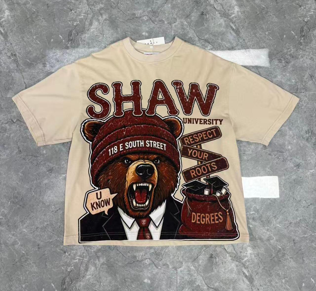
2. Color Direction: Build a Palette, Not a Rack of Isolated Shades
Palette role Useful direction Production question Core Washed black, charcoal, ecru, ink, olive Can the supplier repeat the shade across fabric lots and reorders? Seasonal Dusty mineral tones, faded brights, deep red or blue families Does the color still read correctly after wash, print, and finishing? Accent Contrast stitch, rib, zipper tape, small placement graphic Can the accent be simplified if a trim minimum is too high? 3. Fabric Direction: Tactility, Weight, and Honest Material Choices
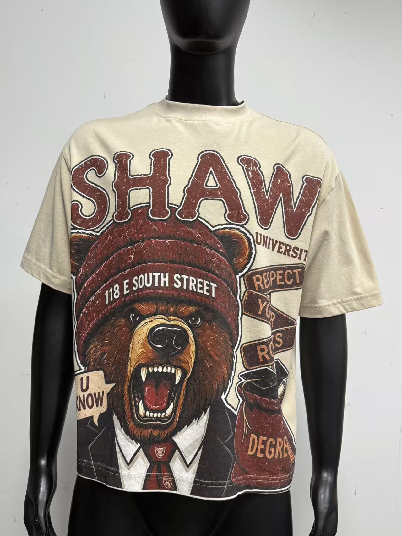
4. Silhouettes: Proportion Is the Main Design Language
Topwear
Bottoms
5. Decoration and Surface: Let Technique Support the Garment
6. Build a Range With a Core, a Seasonal Layer, and a Test Layer
7. Convert Trend References Into a Manufacturable Brief
8. Avoid the Trend Trap: Protect Brand Identity and Margin
9. Sampling and Quality Control Make the Direction Real
10. The Practical 2026 Takeaway